The Brief
BD Connexion Ltd came to EXITO with a clear vision: they needed a brand identity that would represent their position in Bangladesh's apparel industry — a sector built on the craft of stitching, weaving, and connecting threads into something greater.
Their tagline — "Empowering Apparel, Building Connections" — told us everything we needed to know about the brand's ambition. Later refined to "Simplicity in Every Stitch", the identity needed to feel both rooted in textile heritage and confident enough for the international stage.
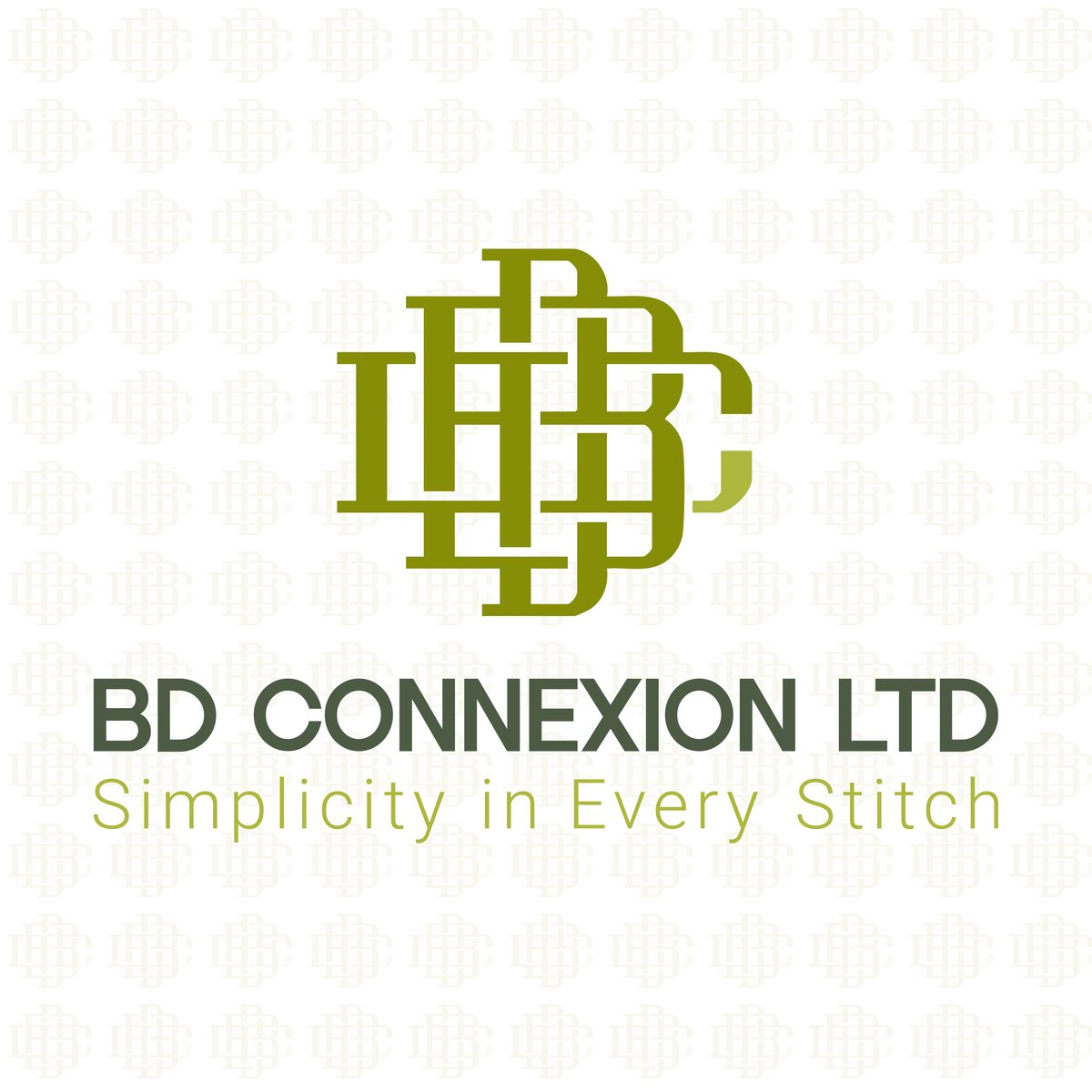
The Concept: Letters as Threads
The core idea was deceptively simple: take the company's initials — B, D, and C — and weave them together the way threads interlock in fabric. Not stacked, not placed side by side, but literally interlocked, with each letter passing over and under the others.
This creates a monogram that works on two levels. From a distance, it reads as a single unified symbol — a mark of quality. Up close, you can trace each individual letter through the weave pattern.
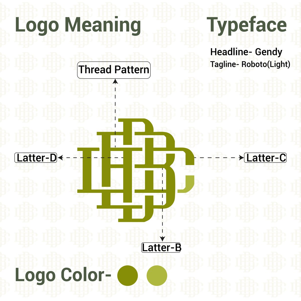
The thread pattern running through the interlocking letters is not decorative — it is structural. Each crossover point in the logo mirrors the way warp and weft threads cross in woven fabric. This gives the logo a tactile quality that connects directly to the company's core business.
The typeface pairing reinforces this balance: Gendy for the company name (strong, grounded) and Roboto Light for the tagline (clean, modern, legible at small sizes).
Structure and Geometry
Every curve and intersection in the logo follows a precise geometric grid. We built the mark on a modular system of circles and straight lines, ensuring that the interlocking letters maintain consistent stroke width and spacing at any scale.
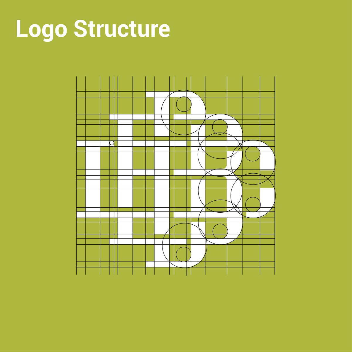
This level of geometric discipline matters because a logo for an apparel company will appear on everything from business cards to shipping containers, from woven labels to embroidered polo shirts. The grid ensures it holds its shape across all of these applications.
Logo Variations
A logo that only works in one configuration is a logo that limits the brand. We developed two primary lockups — a stacked version with the monogram centred above the company name, and a horizontal lockup for contexts where vertical space is limited (website headers, email signatures, document footers).
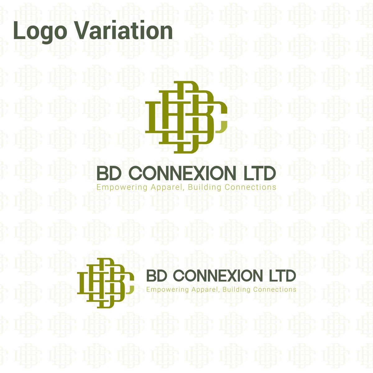
Both versions maintain the same visual weight and proportions. The monogram can also stand alone as an icon — on social media profile pictures, favicon, app icons, or as a watermark.
Colour System
The brand colour draws directly from the textile world — an olive green that evokes natural fibres, sustainability, and craftsmanship. We chose two tones: a deeper olive for primary use and a lighter golden-olive for accents and secondary applications.
The full colour system includes four core combinations, each designed for specific contexts.
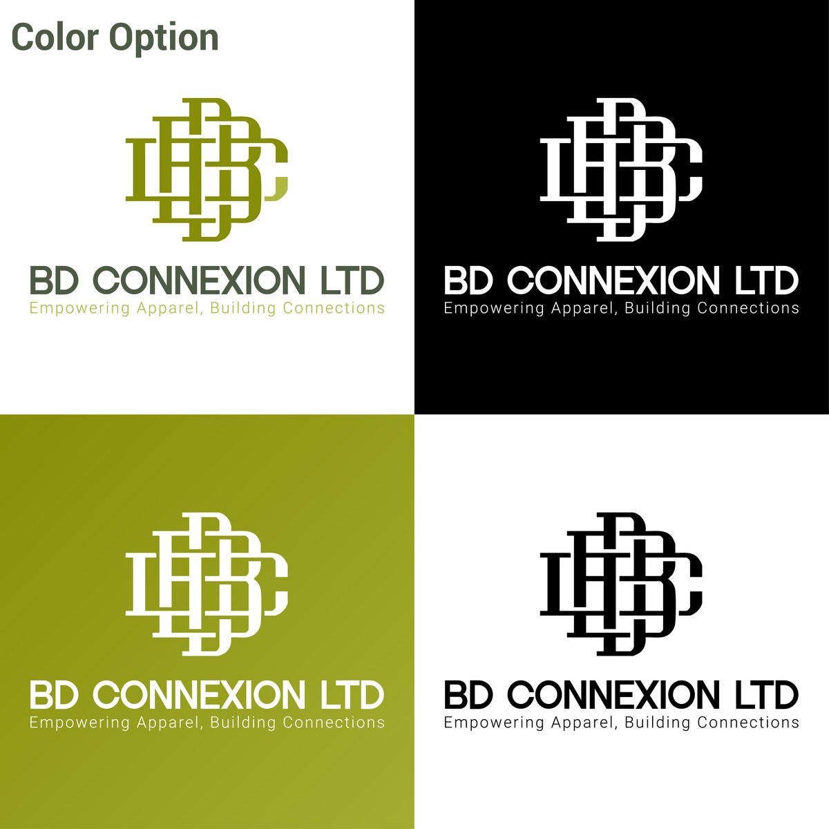
The olive-on-white and white-on-olive versions serve as the primary brand expressions. The black-on-white and white-on-black versions exist for contexts where colour printing is unavailable — fax headers, single-colour embroidery, newspaper advertisements, and legal documents.
In Context: Fabric and Pattern
A brand identity for an apparel company must look at home on fabric. We tested the logo as an embossed embroidery mockup on woven textile — the kind of application BD Connexion would actually use on staff uniforms, showroom displays, and trade show materials.
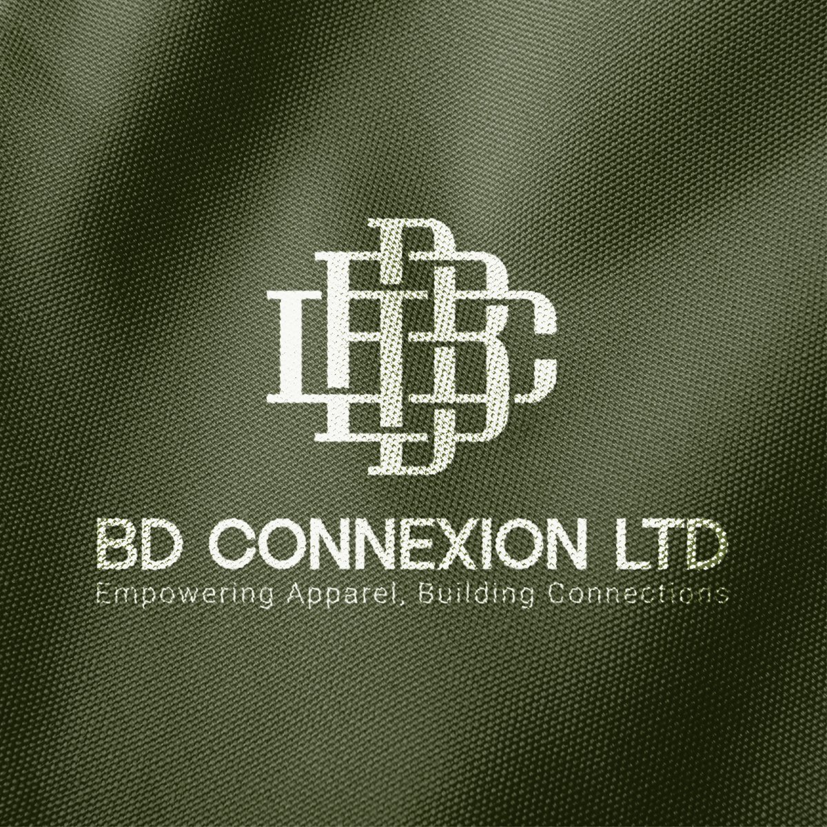
The interlocking thread pattern in the logo translates naturally to embroidered and woven applications. The consistent stroke widths we established in the grid phase pay off here — each line reproduces cleanly in stitched form.
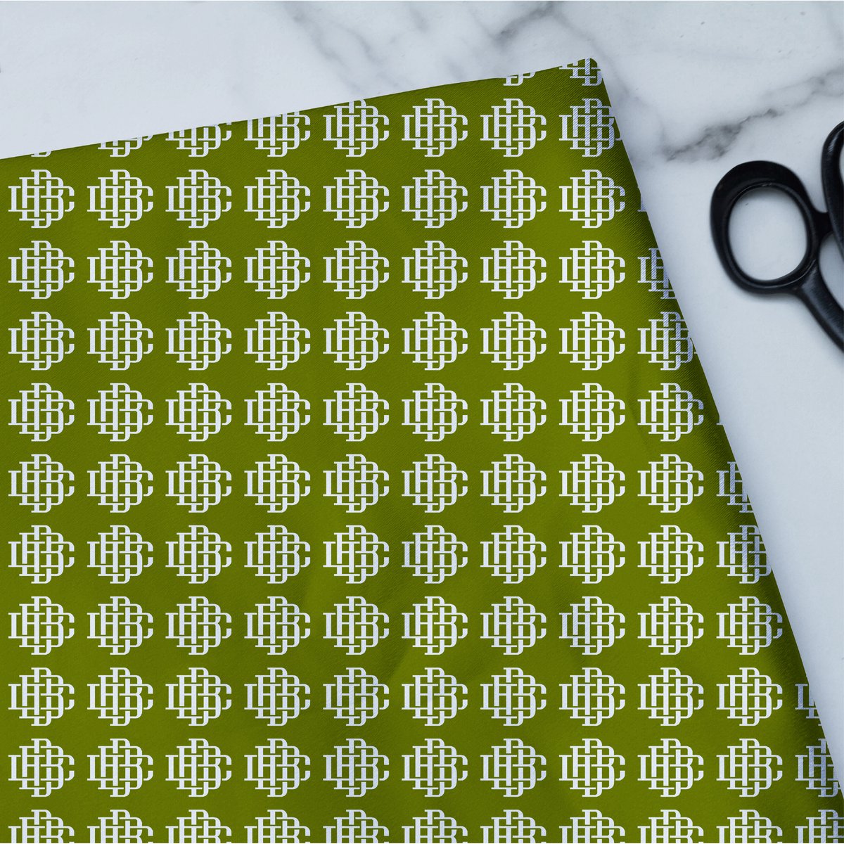
We also developed a repeating brand pattern using the monogram, designed for wrapping paper, packaging tissue, garment bags, and exhibition backdrops. The pattern tiles seamlessly and maintains the brand presence without overwhelming the product.
The Result
BD Connexion Ltd now has a brand identity that communicates exactly what they do through its very structure — letters woven like threads, geometry rooted in textile craft, colours drawn from the natural world of fibres and fabrics.
The logo scales from a 12mm woven label to a 3-metre exhibition banner. It works embroidered on cotton, printed on paper, projected on screen, and etched in metal. It carries the company's heritage in its construction while looking forward to their growth on the international stage.
---
Interested in a brand identity for your business? [Contact EXITO](/contact) — we design logos, brand systems, and visual identities that work as hard as your business does.